Friday, October 30, 2020

Limited palette vs. the Rainbow

Rarely does an artist not have an opinion on how many colors there should be in an effective palette.

I've heard that you aren't a master artist unless you have an extremely limited palette. On the other hand, I have seen paintings which thrilled me and they were created with an expansive palette.

When does a limited palette become a mastery of colors and not a straight-jacket?

When does a huge palette become freedom and not a crutch?

I am not the person to answer these questions for another artist. However, I would like to share some thoughts on how I have, am, and probably will approach this topic.

To give you my starting point, below is my standard palette of Rembrandt oil paints.
Titanium white
Cadmium red deep
Cadmium yellow deep, naples yellow, yellow ochre
Sap green
Cerulean blue, ultramarine blue deep, paynes gray
Raw sienna, burnt sienna, raw umber, burnt umber, VanDyke brown
    Note: for some reason I ended up with 5 browns. It wasn't a conscious effort on my part but each seemed to fill a need.


I don't consider this an extremely limited palette but neither is it huge. There are other Rembrandt colors in my arsenal, but the above are the ones I usually use.

With my influx of new colors from Michael Harding and Richeson, I have the chance to do some free exploration. As I mentioned on a previous blog, most of the colors I ordered were in the reds, yellows, and blues. However, some paints really intrigued me and I added those too.


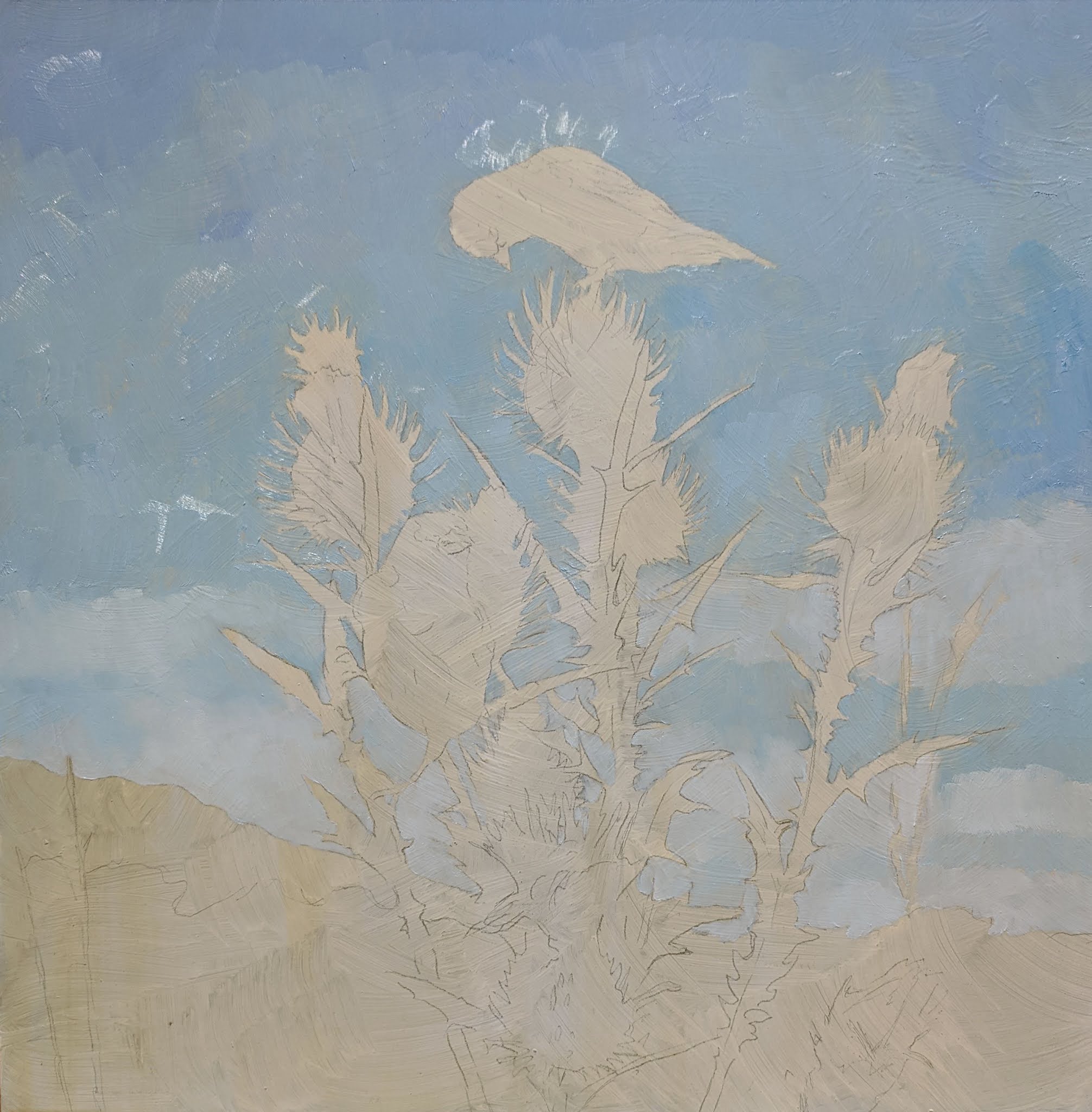
For this next painting, I grabbed one of the Richeson oil paints, manganese violet. When I included this color in my order, I had no idea what it would be like. Even as I put it on my palette, I did not know its character. It is a dark color so I added some titanium white to see more of its flavor. Interesting. Too bright in this application, but if I have only a tiny hint of white, a bit of raw umber, paynes gray, and maybe some van dyke brown, it will be the perfect color for the background foliage.

Could I have mixed this purple-y color from my basic palette? Yes.
Would I have mixed it? Probably not. I just did not see this color in my head when I started the painting, but I think my painting will be more dynamic with its inclusion.

If I can use these new colors to push my color perception and inventiveness, it will be a worthwhile exploration indeed.


Thursday, October 29, 2020

Finished


                                                Original oil by Linda Besse      13" X 13"

Wednesday, October 21, 2020

The birds

Next up, the birds.


Friday, October 16, 2020

New paints!

 I've had the good fortune to win some paints at a couple of competitions. While I have been extremely pleased with my Rembrandt oil paints, some free fun colors are hard to pass up.

My newer Michael Harding hand ground paints out of London have added some nice bursts of color to my work. More recently, I received my Richeson paints. It was time to open and start using them.

For both of these companies, I chose paints in the red, yellows and blues.


For the thistle flowers I thought I'd start with the Richeson quinacridone rose. Oooh, such a rich color! Mixed with a little of the Michael Harding cadmium orange, I had a good base for the inside of the middle bottom flower. Other mixing I did included titanium white for lightening and Rembrandt ultramarine for cooling.


Rembrandt paints are still my go-to paints, but it is fun to experiment with new colors!


Wednesday, October 14, 2020

Thistle


For painting the thistle, I mixed four greens, darkest to lightest. The darkest one is sap green with some ultramarine blue, paynes gray, and a little raw umber. The lightest are two greens mixed with radiant yellow and cadmium lemon yellow (to give a bright pop of color.)

I find painting the darkest color first and then moving to the next lightest allows for easy blending. And, having the darkest section in first helps create the structure of the plant.

Sunday, October 11, 2020

A special bird

 When I was about 6, my younger brother and I spent a couple of nights with our grandmother at her summer cottage. I remember shucking fresh island peas at a wooden table next to a large picture window. This window looked out to a natural yard and beyond was a large island pond (which we would row across), and further out was a barrier beach and then the Atlantic Ocean.

In the lightly mowed natural yard were several very tall (at least for a 6-year-old) thistles. As I looked out the window, a flash of color dove in to one of the thistles. Looking carefully, I could see that it was a yellow bird. What delicate and fragile bird could dive in to something so prickly? Nana answered that the bird was a goldfinch. This bird instantly became my favorite, and remains so.

Surprisingly, I have only done one painting with a goldfinch over the years, so, I am eager to work on this next piece.

Blocking in the sky


The background and thistle for this painting are from the Hudson Valley area in New York State.


Saturday, October 10, 2020

Best Wildlife Award

 Ice Bear just won the Best Wildlife Award at the International Guild of Realism 15th Annual Exhibition held at the Principle Gallery in Charleston, South Carolina.

I understand it took the judges days to decide on the 13 awards for the 111 paintings. With all the competition, I am particularly excited my painting was acknowledged.

To see all the paintings in this show, click here.

Tuesday, October 6, 2020

International Guild of Realism 15th Annual Exhibition

The International Guild of Realism show is now open!


Accepted in to the show is my painting Ice Bear. For a preview, click here.


 To see all the works, click here.