 |
| Jag original oil 8.25" X 11" |

A peek inside Linda's creative process.
Tuesday, December 22, 2020
Saturday, December 19, 2020
Almost Done

While I don't paint every hair, I do keep in mind the direction of the fur. Much of the larger fur sections are painted with a small flat angle brush.
Thursday, December 17, 2020
More Color
The next step is more color, lots more color!

At this stage my palette has a number of yellow, orange, and burnt sienna mixtures. Other than the ears, I haven't painted the lightest "whites" of the cat.
Tuesday, December 15, 2020
More Jaguar
This jaguar painting is a bit smaller than my Gold Collection paintings which are 12" X 9". I thought the type of background I have used for the Gold Collection would lend itself well to this painting.
 |
| Gold Collection - Whooping Crane |
 |
| Gold Collection - Giraffe |

I've made the background a bit cooler than the above Gold Collection to make the warmth of the jaguar's fur really stand out.
So far there is not much color except for the eyes and the nose.

Sunday, December 13, 2020
Evolution of a Jaguar
If you were hoping for a detailed analysis of the biological evolution of the western hemisphere's largest cat, sorry.
This is just how I put together this 8.25" X 11" jaguar painting. In a small format, stripes and spots take a long time to paint but I still like to mix in to my portfolio small paintings of giraffe, zebra and spotted cats.

For this piece which will have a portrait feel, I lightly brushed a turpentine/raw sienna wash over my drawing. (Note: I finished my drawing with a light touch of a 4H pencil so the turpentine would not wash it away.) If you look at the top of the board, you can see the texture of my gesso. For this sized painting, I kept the gessso fairly flat so it did not unduly distract from the small details.
My next step is to use more raw sienna in my wash. I like to start with the eyes so the cat can keep an eye on my progress. To make the eyes come alive, I spend extra time with their shading.

While doing a heavier turpentine wash on all the spots takes time, it will give a warm glow under the spots which reads well in the finished painting.
Friday, December 4, 2020
Bald Eagles!
Each year near the end of November and the beginning of December, bald eagles arrive at Lake Coeur d'Alene, Idaho to feed on the spawning land-locked salmon. Fortunately for me, I live just a little over an hour away.
There is a great spot at the end of the road to watch eagles swoop down to collect their prize. A large parking lot is handy for the numerous eagle watchers. We like to climb down the bank and position ourselves across a small bay. A dead pine on the other side is Eagle Central. Sometimes there are six bald eagles on this one tree (which generates various arguments on who gets a particular branch.)
Yesterday my husband and I were a bit dubious as we drove along the lake to the end of the road. Dense banks of fog were covering the road and lake in spots. But, I was thrilled with the light when we got there.
 |
| An eagle emerging from the fog |
 |
| A salmon the shallows |
 | ||
| Barely hanging on |
 |
| from my trip there Nov. 27, 2020 |
 |
| November 27, 2020 trip |
 |
| And when the sky cleared yesterday! |
Last year the eagle count was highest on December 10th. I think I might need another trip.
Tuesday, December 1, 2020

Monday, November 30, 2020
Leaves
Continuing the compressed time line for this painting, here are the next steps for the piece.


The foreground in the previous image appeared too cool so I have warmed it up.
The leaves have a "designed randomness" to give them a natural feel.

The leaves now have the general shapes I was going after but are a bit dull at this stage.
Once they are dry they can be glazed with brighter yellows, oranges, and reds.
Saturday, November 28, 2020
My backyard
Sometimes the inspiration for a painting is right in my own backyard.
This is a piece I have wanted to paint for several years. One afternoon several ruffed grouse walked through our yard. One male captured my attention when he walked past a pile of wood we hadn't stacked yet. The leaves, the texture of the wood, and the grouse's almost camouflaged feathers made for an intriguing concept.
In designing the painting I wanted the wood pile to be seen first and then the grouse. Once you see him, you wouldn't be able to un-see him.
The Wood Pile
Well, I haven't painted a wood pile before. It seemed like the center was a good place to start.


I started working on this piece while I was waiting for Feast, the previous painting, to dry so I could scan it. Rather than my slow progress blogs, I thought you might like to see a faster evolution to a painting.
Tuesday, November 24, 2020
Word Origins
I'm a pretty good singer. For decades I sang with the Spokane Symphony Chorale, the chorus group with the Spokane Symphony. We sang in German, Latin, French, even Russian with such pieces as Brahms Requiem, Beethoven's 9th, Carmina Burana, various operas, and did a Holiday Pops concert.
For the past several years I have taken a break from the group because my art shows and painting commissions kept me too busy to attend all the rehearsals and even make all the concert dates.
I have a deep love of music and the vocal component in particular.
So it is not surprising that yesterday while painting I broke in to song. The music I was playing was just what I needed and my voice echoed softly around the vaulted ceiling of my studio.
Scratch, our cat, was sound asleep..... until I started singing.
He immediately got off the couch and came over to me. Putting his face up to mine and looking intently at me, he gently trilled. It was a bit disconcerting that he was trying to comfort me from whatever great distress caused me to make those sounds. Granted, I haven't done vocal exercises in a while, but was I really that bad?
That leads me to word origins.
cat·er·waul
/ˈkadərˌwôl/
verb
gerund or present participle: caterwauling
Might this follow the following word origin?
cat er = counter wauling = wailing
Caterwauling: the act of a cat stopping you from singing
Have a beautiful, safe, and amusing day.
Wednesday, November 18, 2020
Finished
For the lion, I used the same approach as I did for the jackels. Create substance but not overly fussy detail which would distract from the backlighting effect.

To complete the scene, the grass needed to be painted. The above in progress image has grass suggested in the foreground. Even at this stage, the foreground seemed a bit plain.
The new color I used for the background bushes, Richeson's manganese violet, would create interest and continuity.
Below is the scan of the completed painting.
 |
| Feast Original Oil 15" X 24" |
Sunday, November 8, 2020
Black-backed jackels
When I had a chance to see some original N. C. Wyeth paintings, the ones with backlighting especially drew my attention. It seemed the drama was intensified.
I came across this lion with his zebra on an early Namibian morning. Black-backed jackels were hanging around hoping for a morsel. The backlighting intrigued me and with dozens of reference photos, I had the start of an idea.
There were more than a dozen jackels in the area. The question was how many to include and in what positions to put them relative to the lion and to each other. I opted for three. They make a group but don't overwhelm the scene.
As for position, I thought an overall triangular composition would work.

With photo reference, backlit objects can be underexposed, flat, and lacking in detail and color. As a wildlife artist I do use my photos for reference but that is just the beginning. Much of my painting will come from the time when I lowered the camera to study the colors, lighting, atmosphere, and interactions.
In this type of backlighting, I want the jackels to have substance but not a lot of fussy detail.

Next up, the lion and the highlights on the jackels and zebra.
Tuesday, November 3, 2020
Grasses and Zebra

Now for the dead zebra. I am not a big fan of showing lots of gore. I don't want my painting to be a horror scene even though predator/prey interactions can be bloody. However, painting lions and zebra frolicking together would hardly be very realistic. The goal is to show the majesty of the lion without being overcome with sadness for the zebra. It's a thin line.
Most of the zebra is painted except for the highlights.

Friday, October 30, 2020
Limited palette vs. the Rainbow
Rarely does an artist not have an opinion on how many colors there should be in an effective palette.
I've heard that you aren't a master artist unless you have an extremely limited palette. On the other hand, I have seen paintings which thrilled me and they were created with an expansive palette.
When does a limited palette become a mastery of colors and not a straight-jacket?
When does a huge palette become freedom and not a crutch?
I am not the person to answer these questions for another artist. However, I would like to share some thoughts on how I have, am, and probably will approach this topic.
To give you my starting point, below is my standard palette of Rembrandt oil paints.
Titanium white
Cadmium red deep
Cadmium yellow deep, naples yellow, yellow ochre
Sap green
Cerulean blue, ultramarine blue deep, paynes gray
Raw sienna, burnt sienna, raw umber, burnt umber, VanDyke brown
Note: for some reason I ended up with 5 browns. It wasn't a conscious effort on my part but each seemed to fill a need.
I don't consider this an extremely limited palette but neither is it huge. There are other Rembrandt colors in my arsenal, but the above are the ones I usually use.
With my influx of new colors from Michael Harding and Richeson, I have the chance to do some free exploration. As I mentioned on a previous blog, most of the colors I ordered were in the reds, yellows, and blues. However, some paints really intrigued me and I added those too.
For this next painting, I grabbed one of the Richeson oil paints, manganese violet. When I included this color in my order, I had no idea what it would be like. Even as I put it on my palette, I did not know its character. It is a dark color so I added some titanium white to see more of its flavor. Interesting. Too bright in this application, but if I have only a tiny hint of white, a bit of raw umber, paynes gray, and maybe some van dyke brown, it will be the perfect color for the background foliage.

Could I have mixed this purple-y color from my basic palette? Yes.
Would I have mixed it? Probably not. I just did not see this color in my head when I started the painting, but I think my painting will be more dynamic with its inclusion.
If I can use these new colors to push my color perception and inventiveness, it will be a worthwhile exploration indeed.
Thursday, October 29, 2020

Wednesday, October 21, 2020

Friday, October 16, 2020
New paints!
I've had the good fortune to win some paints at a couple of competitions. While I have been extremely pleased with my Rembrandt oil paints, some free fun colors are hard to pass up.
My newer Michael Harding hand ground paints out of London have added some nice bursts of color to my work. More recently, I received my Richeson paints. It was time to open and start using them.
For both of these companies, I chose paints in the red, yellows and blues.

For the thistle flowers I thought I'd start with the Richeson quinacridone rose. Oooh, such a rich color! Mixed with a little of the Michael Harding cadmium orange, I had a good base for the inside of the middle bottom flower. Other mixing I did included titanium white for lightening and Rembrandt ultramarine for cooling.

Rembrandt paints are still my go-to paints, but it is fun to experiment with new colors!
Wednesday, October 14, 2020
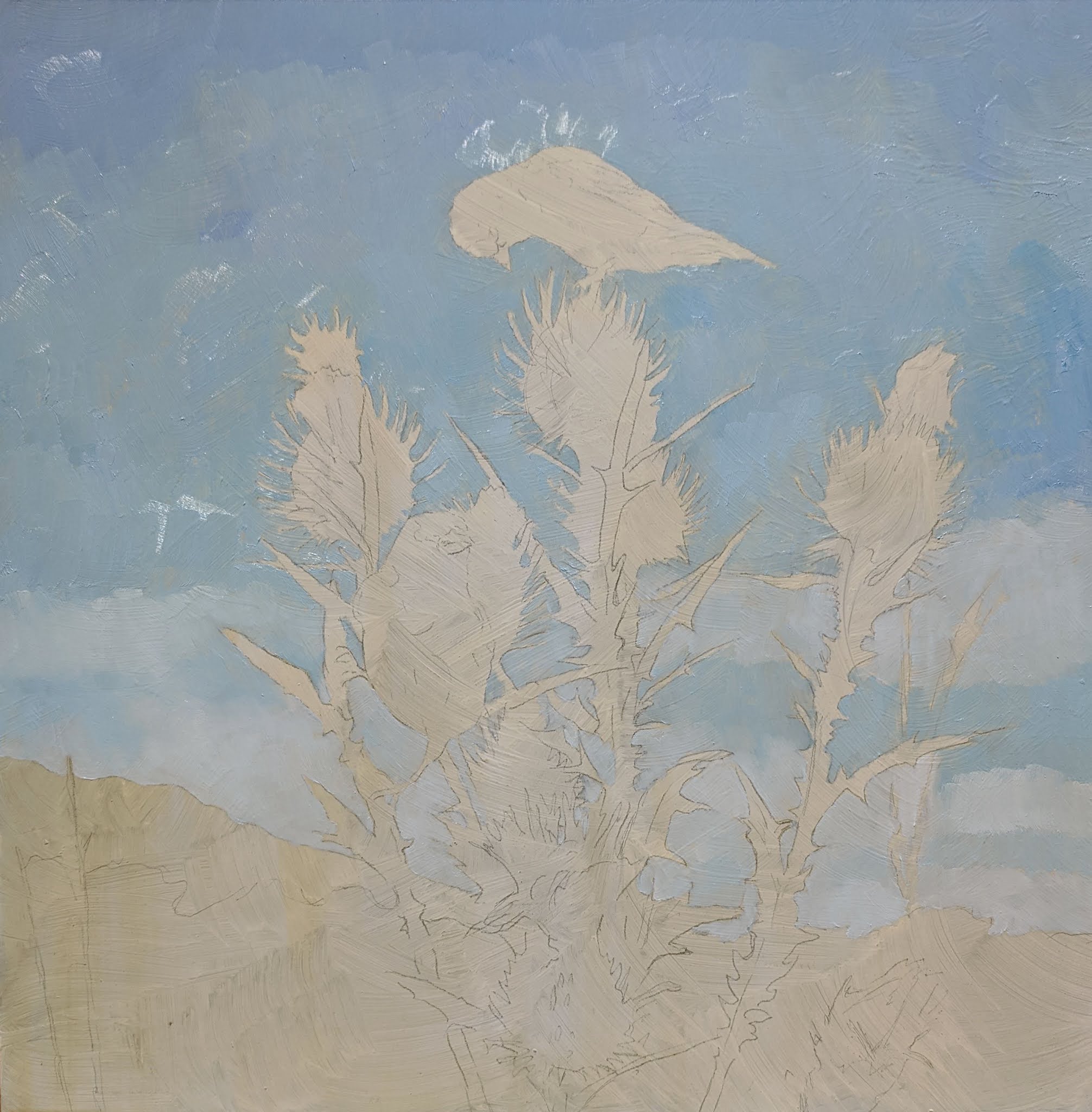
Thistle

For painting the thistle, I mixed four greens, darkest to lightest. The darkest one is sap green with some ultramarine blue, paynes gray, and a little raw umber. The lightest are two greens mixed with radiant yellow and cadmium lemon yellow (to give a bright pop of color.)
I find painting the darkest color first and then moving to the next lightest allows for easy blending. And, having the darkest section in first helps create the structure of the plant.
Sunday, October 11, 2020
A special bird
When I was about 6, my younger brother and I spent a couple of nights with our grandmother at her summer cottage. I remember shucking fresh island peas at a wooden table next to a large picture window. This window looked out to a natural yard and beyond was a large island pond (which we would row across), and further out was a barrier beach and then the Atlantic Ocean.
In the lightly mowed natural yard were several very tall (at least for a 6-year-old) thistles. As I looked out the window, a flash of color dove in to one of the thistles. Looking carefully, I could see that it was a yellow bird. What delicate and fragile bird could dive in to something so prickly? Nana answered that the bird was a goldfinch. This bird instantly became my favorite, and remains so.
Surprisingly, I have only done one painting with a goldfinch over the years, so, I am eager to work on this next piece.
 |
| Blocking in the sky |
 | |||
| |
 |
| The background and thistle for this painting are from the Hudson Valley area in New York State. |
Saturday, October 10, 2020
Best Wildlife Award
Ice Bear just won the Best Wildlife Award at the International Guild of Realism 15th Annual Exhibition held at the Principle Gallery in Charleston, South Carolina.

I understand it took the judges days to decide on the 13 awards for the 111 paintings. With all the competition, I am particularly excited my painting was acknowledged.
To see all the paintings in this show, click here.
Tuesday, October 6, 2020
International Guild of Realism 15th Annual Exhibition
The International Guild of Realism show is now open!
Accepted in to the show is my painting Ice Bear. For a preview, click here.

To see all the works, click here.
Tuesday, September 29, 2020
Sometimes Life Requires a 4-inch brush
Yes, sometimes life requires a 4-inch brush. Literally.
After I painted a barn quilt for our shed in the summer of 2019, I knew that I wanted one for the studio. My studio is above a 3-car garage and gives me approximately 760 square feet to work. Overlooking a ravine with a year-round creek, its cathedral ceiling and skylights are an artist's dream.
My husband and I designed it and he built it. The studio came out even better than I envisioned.
And, after 19 years, it was time for an exterior paint job and new stairs. AND, a barn quilt.
 |
| my barn quilt on the shed July 2019 |
For the new barn quilt, I am using the same materials. Pressure-treated plywood, 4' X 4'
The studio barn quilt is the other half of the original 4' x 8' sheet of pressure-treated plywood. To create consistency, I decided to use some of the same colors from the shed quilt for the studio quilt.
Step one: Two coats of quality exterior paint on the plywood. I like to use the building's color. Some of my design uses the building's color giving the design a more airy look. You can fill in the imperfections of the board before painting, but I like the rough look. Feels more like barn wood to me.
Step two: Layout the design. For drawing lines at an angle across a 4' section, I use a 6' level's edge as a guide.

Step three: Start in the center and paint all of one color. All the colors are premium exterior paint.


Now that the barn quilt was done, the studio had to get painted.
Sometimes life requires a 4-inch brush and a 45' lift. My husband rented a lift so he was not moving a ladder three feet at a time.


Step four: Install the barn quilt. We used 2.5" and 1.25" exterior grade cabinet screws rated for pressure-treated products.

 |
| View from our kitchen deck |
And there are times when life requires a 4-inch brush, figuratively. Times when we should be looking at the broader picture and not be mired in details which will not matter next week, or even tomorrow. When life seems to be filled with crevasses, maybe a four-inch brush can smooth our path.
Wednesday, September 16, 2020

Subscribe to:
Posts (Atom)